Loyal, Brave, and True

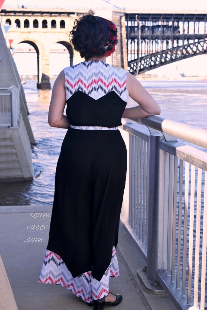
     I’m changing up my normal vintage content to present to you a historical outfit of a circa 1913 blouse and skirt set.  This post’s project is perhaps my most unusual historical sewing attempt as I was also trying to have it be a creative interpretation of a Disney movie’s leading lady.  This means yet another official installment to add to my ongoing “Pandemic Princess” blog series!  However, having a soft spot for 1910 era fashion, I found myself deeming this as my top favorite historical make.  My project soon morphed into a bigger, more intensive sewing expedition which took up most of one summer’s free time a few years back.  This post therefore only shows part one of the overall intent to create a versatile wardrobe of authentic early teen’s era separates.  I hope you enjoy seeing me in a different style!  I am so proud to have a historical outfit that truly feels so well suited to my taste and personal style.  It was a labor of love to create.

     “Mulan” (a 1998 animated feature film) was the preliminary impetus behind my set.  Mulan is special in her own right being Disney’s first attempt at Asian representation.  Furthermore, Mulan is a heroine who was not awarded, born or married into royalty, rendering her the honor of being the first non-princess main character.  Even with any failings in being culturally appropriate, such representation is still worth celebrating.   Mulan’s fierce loyalty, adaptive intelligence, and inherent bravery renders her as one of the most dynamic female protagonists for Disney.  Combining these traits with her great filial piety, dogged determination, and tendency to self-reflection makes her an indomitable leading lady.  Her Disney movie was the first of its (now common) kind of genre, offering an independent female role model who is capable, strong in character, and can take care of herself.  

     My post’s title comes from the Chinese symbols for “Loyal Brave True” which were etched on the blade awarded to Mulan’s father.  These three words are inherent to the story since that sword was the weapon she took from home when she disguised herself as a soldier to fight for both her country and her family’s honor.  In the 2020 live action telling of Mulan’s story, the symbol for “Family” is also added when the paternal sword becomes her very own.  The new movie remake happily included an excellent song adaptation of these famous words so synonymous with Disney’s Mulan.  Singer Christina Aguilera, who performed the song in a music video for the newest (2020) live action Mulan movie, has stated that the “meaning holds the test of time: staying true to yourself, being who you are, and teaching how to be fearless.  ‘Loyal Brave True,’ represents the fine balance between vulnerability and strength.”  

     The story of Mulan has been retold and remade for many centuries now.  Mulan is originally a fictional folk song or ballad poem comprised of 392 characters whose story originated from the Northern “Wei” Dynasty (4th to 6th-century) of China.  Many historians do seem to agree on the understanding that Mulan’s people were “Xianbei, a semi-nomadic, early Mongolian people who lived in what today is Northern China.  The story wasn’t based on anything factual, but was a legend sung to children or recounted as a source for national pride. In 1593, playwright Xu Wei dramatized the Ballad of Mulan into a stage adaptation called, “The Female Mulan,” and the longer narrative grew more popular. Even before the 1998 version of Mulan, there were a handful of other film adaptations released which helped popularized her story to a worldwide audience. 

THE FACTS:

FABRIC:  The skirt is a cotton and poly blend “linen-look” woven, fully lined in a cling free polyester, with a buttery yellow poly crepe hem contrast.  The blouse is a Pima cotton lawn “Pimpernel” print by William Morris, with a whisper thin vintage ivory cotton overlay for the front bodice panels and sleeve cuffs.

PATTERNS:  for the top – a “Small Sized Blouse Pattern” circa 1913 reprinted from Past Patterns; for the bottom skirt – a Simplicity #8640, a “Titanic” movie inspired suit set pattern from the year 1999

NOTIONS:  I used special true vintage notions on this outfit – the buttons, hook-n-eye closures, cotton lawn bias tape, and the blouse’s add-on collar. The buttons are probably 1940s or 1950 era but the rest of the notions were either from the 1910s or 1920s.  Other than that I used modern supplies on hand – lots of thread and one zipper for the skirt.

TIME TO COMPLETE:  The blouse needed almost 30 hours to make while the skirt took me 15 hours to finish.  Both were worked on through July 2021.

THE INSIDES:  My blouse is finished with French seams and my skirt seams are covered by the lining. 

TOTAL COST:  The blouse’s fabric was the only real significant expense – about $20 for one yard, from Minerva Crafts.  I did also buy the butter yellow crepe contrast (which sticks out from under the skirt hem) at $7 for one yard from my local JoAnn Fabrics store.  All else was bought second hand so it was very cheap.  For the skirt, the yellow linen-look was $3 for 6 yards (I only needed 2 for the skirt) and the skirt lining and zipper was on hand in my stash.  For the blouse, the antique collar was $3 and the vintage sheer cotton overlay was $1 for 3 yards.  The card of old buttons – which went towards both pieces – were only $1 at an antique store.  My total for this outfit is about $35.

     I have been thrilled to have reasons to wear this set to several events since.  These occasions gave me the opportunity to try different accessory pairings to sport a different flair.  Doing so shows the varied sources of inspiration which helped make my creation a success, too, beyond just having a Mulan interpretation.  As much as I originally planned this to be a historical princess set, I found myself additionally inspired by the “Art Nouveau” and “Arts and Crafts” Movements of the 1910s as well as Rose’s fashion in the iconic 1997 Titanic movie throughout my planning process.  I chose my favorite William Morris art for my blouse – the “Pimpernel”, printed circa 1876 – and then actually wore it to an exhibit in Chicago that was highlighting his original work!  How special is this opportunity!!  Then, I specifically drafted certain details into my skirt so it could work as part of a larger Titanic movie inspired set – the part two of this post I mentioned above.  As I will point out again and again, this is an amazingly versatile historical set of separates!  Thus, do not be surprised if you see different non-Mulan themed pictures thrown in throughout this post.

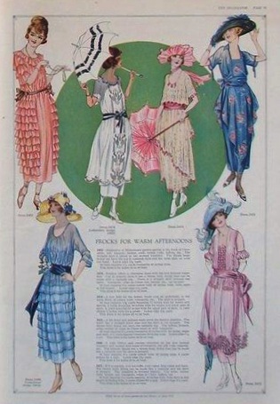
     Going back to the topic I was on above “The Facts”, the year 1913 – for as prim and pretty as the fashions from that time are – seemed just right to channel the spirit of Mulan.  It was at the forefront of the age of the “modern woman”.  The previous Edwardian era of leisure and romanticism was at its tail end, World War I was just about to begin, and the role of women in society was changing.  They were beginning to fend for themselves, do without husbands or servants, gaining the right to vote (such as in Germany, Austria, Canada, and the Balkan states), and even beginning to take the place of men in the workplace like never before.  This is was one main symbolical reason for choosing 1913 to interpret Mulan.  Women from all over the world in 1913 needed Mulan’s traits to get through the tough times that were ahead of them!   They needed versatile separate pieces to wear for that newly active independent life, items that were just as easy to wash as they were to match with.  Much like how Mulan’s clothes (aka, her soldier’s attire) reflected her change of state of life, many women of the 1910 decade were no doubt wearing a uniform of some sort after 1914.  Perhaps it was because they were serving the military, assisting in nursing, hired for factory work, or being an ambulance driver.  Whatever the reason, their clothes – in or out of uniform – became something which needed to be workable and practical in some capacity and separates over dresses were more necessary than ever.    

     I did not want an outfit of cultural interpretation here.  Instead, I chose to channel the era of fashion  history which mimicked the long skinny skirts, obi belts, and arrow-style sleeves of what Mulan wears (when not in soldier’s uniform) in the ’98 animated film.  The most wearable, natural interpretation for me to have a historical basis for Mulan’s outfit (with no ethnic association) was to channel the early 1910s.  The slender “hobble” skirts, sash belts, ornate hairstyles, and beautiful blouses of the first few years into that decade matched with Mulan’s aesthetic perfectly.  I also wanted to take things a step further and channel one of her outfit colorways, too.  I am a sucker for a pretty yellow, and noticed a butter yellow color in the skirt she wears when we first meet her doing her morning duties at home.  Serendipitously, 1913 seemed to have a soft yellow color frequently recurring in the fashions of the year.  Those 6 yards of yellow linen-look fabric that had been picked for no other reason than being cheap, suddenly had a purpose.

     This general idea became a guiding inspiration when I found an antique decorative hair comb while out visiting vintage shops with a friend.  For me, it is rare to have an outfit idea clearly come together due to an accessory, yet I daresay such a path worked out well here.  My hair comb is a golden yellow which pairs well with my butter yellow skirt, and so it led my overall colorway choice to become warm but soft earth tones. 

The hair comb, however, had such a perfect symbolism to tie in with the outfit.  There are blossoms etched into the comb’s intricate details reminiscent of the Mulan Magnolia.  The comb itself is curved much like traditional half-moon Chinese hair ornaments, too, besides the fact it is dated to the teens or early 1920s.  I could not have been happier at discovering this find, especially since it was such a reasonable price.  Luckily, my friend encouraged me not leave it behind.  With the added jewels, inset mother-of-pearl flower petals, and carving details that blow my mind, I feel so honored to be its owner now.

     The Disney film’s plot takes place in China during the Han dynasty,where Fa Mulan, daughter of aged warrior Fa Zhou, impersonates a man to take her father’s place during a general conscription to counter a Hun invasion.  This is not true to the traditional ballad poem (which I explained above “The Facts”).  Thus it makes sense that I see the artistic license of the animated movie as showing her blouse as a Hanfu, the traditional styles of clothing worn by the Han people in China.  Her sleeves are often arrow-style, most often seen on a northern Chinese Hanfu. 

I was giddy when I got a pic of my blouse in front of Morris’ original “Pimpernel”! Look at the clear arrow sleeve shape.

No doubt, Mulan’s clothing was drawn this way because she was a practical and very active character.  Yet, her sleeves also make sense if you are trying to look at the film with a historical point of view.  Arrow sleeves (called “Jian Xiu”) are cut as one with the main body of the garment.  They are wide for freedom of movement, tapering down above the wrist to a close fit, and normally end with a cuff.  A very similar style of blouse was already not just common but popular in the 1910 era.  I happened to have a version dated to 1913 on hand already in my pattern cabinet, bought many years back.  I was so happy to not have to hunt for what I needed and just start sewing.  My stash saved the day.

     My blouse is definitely the more historically accurate of my two pieces.  I used a pattern reprint that was directly copied from an original, one of the reasons why I love Past Pattern Company.  I also used period appropriate techniques and materials.  The skirt is just as period accurate in style and cut, only my material is a polyester blend made to look like a nubby linen or fine crepe.  Then, I had to adapt that famous Simplicity Titanic-inspired pattern to be more 1913 accurate.  My hidden closure system hides a modern zipper in the skirt, too.  I’m only half ashamed over my modern updates because they make historical dressing so darn convenient and no of them are obvious to see.  I’m not that much of a purist to look down on either piece.  I LOVE wearing them both equally – apart or together.  Comparing the skirt against the blouse is a tough call.  With all of the true antique additions and hand sewing time I invested, as well as the greater versatility it provides (I can pair it with my modern skinny jeans) I have to prefer the blouse!

     The blouse’s pattern was quite easy to follow and understand even though there were very limited instructions to go on.  It was offered in a size that is too small for my everyday body, but with my corset it would fit.  I assumed that the gathers would lend the bust and shoulders to run a bit generous and I was right.  However, there is supposed to be excess fabric to create the draping and soft bodice look.  It is so freeing to have something so elegant give me such reach room and unrestricted movement!  What also helped give this blouse a further air of simplicity was not having any facings.  I used old cotton lawn bias tape to cover the edges and finish the inside seams.  Now I did counter this ‘shortcut’ by doing hand sewing on everything other than the inner seams, but the beauty and delicacy of this blouse helped the extra effort feel justified to do and very appropriate.   

     It was so fun to see the way so many different elements came together for this blouse.  Firstly, I would like to brag that the pattern called for almost 3 yards of 36” material, yet I made it work with only 1 yard of fabric at 60” width.  Then, I only needed to sacrifice a few small scraps from my prized vintage sheer cotton yardage find to use as an overlay.  Yet, I think this extra step adds so much depth and complexity to the blouse without changing the colorway or adding another print.  The vintage notions I used were special, too, but nothing can beat the antique collar at the neck.  I found this collar at the same shop that I bought my hair comb from, so I felt that notion was meant to be part of this outfit.  It was the perfect shape and length to match the blouse pattern’s collar and had an attachment base as if it had never been used before, so I couldn’t be happier to give it a proper space to shine for the first time.  The collar is 1910 era in the way it has a fine cotton bobbinet as its base, and the lace seems to have been handmade by someone insanely talented.  I love the opportunity to experience such amazing artistry and fine work that sewing historical clothing presents.

     The skirt is everything I wanted for this project.  It turned better than how I envisioned and definitely makes me feel as if I have a small part of the fictional Rose’s wardrobe out of the 1997 Titanic film.  I knew I had to pull out the iconic Simplicity #8640 from my stash.  I used another true antique 1912 reprint from Past Patterns (which I posted here for my “walking suit”) as my basis to create a more period appropriate silhouette with which to true up the lines of the 90’s Simplicity pattern.  The most glaring ‘faults’ of the 90’s pattern was its flared, bell-bottomed hem and elastic waist – ugh, I was not keeping either feature. 

I looked at the asymmetric front hem skirts as seen in old photographs and fashion illustrations to figure out how to get rid of the front tie gathered hem casing which the Simplicity pattern called for.  Then, I drafted pleats into the front, instead, so the fabric falls like a soft waterfall.  Finally, I drafted the rear to have a center box pleat which slims the skirt by sweeping the excess back into the waistline…just like what was on Rose’s yellow dress in Titanic!  Together, I made my own hybrid pattern for a 1913 skirt that is more elegant and more unique than either pattern intended.  This was the most self-drafting that I have yet put into a historical piece and I am pleased with realizing such an accomplishment.

     The biggest challenge to sewing the skirt was keeping it lightweight but also opaque.  The linen-look is sheer and the light yellow color acted the same as if it was a white.  I used a matching yellow lining that I had on hand so as to not dilute the color.  The lining has a deep ‘hem’ of the contrast crepe fabric, and that is double layered so as to weigh down the skirt properly.  This keeps things opaque from the knees down.  Even still, adding two more layers of historical underclothes (slip and bloomers) finally prevented my skirt from either showing my corset or being see through.  Whew!  I will now know what to expect when I make something in the future out of the 1 ½ yard remnant leftover…I should underline the heck out of it!

     Working a fancy hairstyle that could be a both historical and remotely Asian in reference, while also accommodating the hair comb, was my most difficult challenge to my final outfit look, though.  Yet, after many failed attempts, I think I perfected my hair in time for our pictures.  For my Mulan look, I brought my 1920s hand painted fan and remembered my vintage bar pin to close my cummerbund sash.  We chose to take pictures in front of the Chinese pavilion at our local park.  Notice the dragons “guarding” the place at each cornice!  It was not only yet another cultural reference to honor Mulan but also a way to remember one of Disney’s best side characters of all-time – the spunky red dragon Mushu (voiced by Eddie Murphy).  I even splurged on an enameled dragon necklace just because I love Mushu so much – go laugh at his best moments here.  It is always the most exciting part of a project to see the last details come to life by styling everything together for having my pictures taken. 

     Mulan is such a well-loved character to many today, and has a larger-than-life appeal that gives her story a realistic quality.  For being a warrior woman of ages past, her character’s life lesson is also easy to emulate – each of us can practice being loyal, brave, and true in our everyday existence!  Furthermore, I hope this historical set will not just make you think about the timeless tale of Mulan, but also inspire you to be brave enough to throw in a bit of fantasy and creativity into your wardrobe.  It sure took a bit of gumption for me to walk all over busy downtown Chicago dressed like this, but hey – I dress for myself.  I did receive some happy comments from passerby’s who appreciated seeing something dreamy and different!  After all, it is little things like the spectacle of a great painting, the fantasy of a good story, and the limitless boundaries of imagination which season the human existence with intangible beauty to give life a bit of refreshment and wonder.  I love how the 1910 era brings the fine arts into life by merging it with fashion!

I’m in front of a giant mural of William Morris’ “Strawberry Thief” at the Art Institute of Chicago.

1930 “River City” Beach Pyjamas

Living the Midwest of America, I am surrounded by land and thus far away from any real beach.  However, I am surrounded by rivers, streams, and creeks!  The lack of real coastlines doesn’t stop me from sewing myself a set of 30’s beach pyjamas, complete with a matching short sleeved jacket cover-up.  These pieces are the ultimate vintage garment for casual living, so good they’re timeless, really.  It is yesteryear’s equivalent of a loose fitting, wide legged jumpsuit that’s as unassuming as your nightwear yet flawlessly chic.  They are now over 100 years old now, being born of the atmosphere of leisure following the end of WWI, and were the first popular trousered garment to be worn in public for women.  After spending too long being overly anxious to take on such an unusual project, I have now conquered and succeeded in coming up with some ‘new’ vintage for my wardrobe that I absolutely love.

It is actually quite hard to photograph black in a way to always show that my bottom half is actually divided and not just a skirt.  Between the breeze on the flood wall where I was and the evening light, it was challenging to demonstrate these beach pyjamas as truly trousers!  This is half of why I like them, nevertheless…they are a sneaky bit of a chameleon garment, especially since I made the jacket cover-up reversible!  Its look is variable at any given moment.  Passerby people probably wondered, “Is she wearing a dress or is that a sort of a jumpsuit?  Wait, how does she get that on?  Is it vintage or some modern resort wear?”  The resolutions are not obvious merely looking at my pictures either, I’m guessing.  All will be answered in this post! 

For these pictures, I am at what is one of the most classic spots for St. Louis’s Downtown – the Mississippi riverfront at the base of our emblematic monument “The Arch”.  Behind me is the famous Ead’s bridge.  My hometown is called “The Gateway to the West” for more than one reason, among which is the fact that our location is prime for travel and transport of goods among the river route.  The Eads bridge added to our prestige as the first south of the Missouri river, now the oldest still existing to span the “Mighty Mississippi” river.  It was commissioned by Andrew Carnegie, named for its designer and builder, James Buchanan Eads, and completed in 1874 with a dedication ceremony by President Ulysses S. Grant

The Eads bridge was installed and built with what was then pioneering technology, so much so that it still holds several records for its construction feats.  Happily, due to recent (but costly) maintenance, it still is being used for its original purpose to this day.  I suppose I am one of those old-fashioned locals that takes a higher pride in our useful, historic bridge – a symbol of St. Louis that now takes second sitting to ”The Arch”.  Both are equally tied to the river town that we are, and therefore the perfect backdrop for celebrating some regional pride while in my vintage summer fashion!  

THE FACTS:

FABRIC:  the black portions are a 100% rayon crepe, while the contrast is a 100% cotton quilting print.  The jacket lining and pyjama facings are in a bleached, sheer, white cotton muslin.

PATTERN:  Past Patterns Company “Beach Pajamas and Jacket Pattern”, circa 1930 reprint

NOTIONS NEEDED:  lots of thread and one zipper for the pants side seam

TIME TO COMPLETE:  The pyjamas were finished on August 28, 2019, after 30 something hours of sewing.  The cover-up coat was made in 4 hours, and completed on September 4, 2019.

THE INSIDES:  The jacket is fully lined, the pyjamas are French seamed

TOTAL COST:  The cottons were from my local JoAnn Fabric store, the rayon was an online purchase – both bought many years back now.  I have no idea as to my total cost anymore.  Keep in mind, though, that beach pyjamas need a lot of material – almost 4 yards (45” width) for the solid black and 2 yards for the print contrast.  

Just to clarify before I go any further here – in the United States (where I live), we tend to use the spelling “pajamas”, so by now you may be thinking I have plenty of typos.  Yet, that spelling is all too commonly associated with nightwear today for those who are not accustomed to the past fashion history for this term.  I am using the term “pyjama” because of the way this garment was spelled when it first became popular.  When including a “y”, the term also strongly alludes to its European origin.  Beach pyjamas blossomed at the Italian Lido in Venice and the French Riviera in the 1920s, especially so at the hands of Chanel.  She took it upon herself to turn them into the fashionable pieces we know them as today versus the practical, sun protective cover-ups they were in the late 1910s when they began to be worn on beaches and not just indoors.  There have been other sites who have written extensive, informative posts on the history of beach pyjamas (such as “The Vintage Woman” magazine, the BBC, the British Pathé, or “Messy Nessy”) so I will not do so myself, here.  I have already addressed the early beginnings of bifurcated bottoms for ladies in this post of mine on the history of the jumpsuit, after all.  I’ll not repeat myself, but now at least I have explained myself!  

The preliminary challenge I faced in sewing my own beach pyjamas was deciding on what design to choose.  There are so many reprints and vintage inspired patterns out there now!  Check out this post at “Vintage Gal” for some inspiration.  I personally gravitated towards the Past Pattern one, as it was a set with a cover-up and it had complex seaming.  I knew it would also be difficult to adapt to my needs as it is a much larger size than what I needed.  Nevertheless, I am a long-standing patron of that company.  I love the quality and accuracy of their pattern reprints. Therefore I painstakingly pinched out a total of almost 6 inches from the width (spread out in many small ½ increments), then equaled up the horizontal bust-waist-hips points, and trued up all the lines.  This was quite tricky to do with the contrast pieces being so very zig-zagged along the joining seams, but I chalked it all up to being good for me to gain practice in grading.  Sheesh.  Yes, I do tend to be hard on myself.

I meticulously measured the heck out of everything after I was done re-sizing to make sure at the beginning that this would fit.  My chosen “wearing ease” was about 3 ½” so I could have something in between a close and a loose fit.  I only had one chance at this with the ‘only just enough’ amount of chosen fabric I had on hand!  That being said, testing the fit of a paper pattern is nothing like actually cutting and sewing those same pieces out of a slinky rayon crepe.  My finished pyjamas fit just a little more loosely than expected, which was fine because that’s what helps make them the effortless, breezy casual and cool summer garment that they are, but – all in all – turned out perfectly!  Once it is understood how to ‘read’ and refine a pattern at the preliminary stage, it can save much grief, time, and cost of material.    

It was interesting to construct as a wrap-on garment and is a bit counter-intuitive to put on.  I couldn’t bear to sew a welt “window” opening right through the center front of the bodice for the one wrap waist closure tie.  This was how the pattern instructs.  I felt the rayon was too supple for that and I liked the simplicity of a solid main body since the contrast was busy and bold.  So I improvised slightly.

Unlike most wrap-on dresses or jumpsuits, this one – as I made it – does not have one tie slip through a gap at the opposite side seam.  I merely attach the left wrap, which is sewn to the pants halfway across the front up until the center front seam, to the right side seam from the inside seam allowance.  I chose to close it with a button (on the end of the left wrap) and buttonhole elastic (on the right side seam).  This way the closure is both adjustable and comfortable and it is also easier to close with the elastic.  Then I take the other wrap half, the top wrap which has a tie at its end, across the front over to the left side seam, which has another tie end attached to the side seam just above the zipper.  I like to wrap the ties fully around my waist, as if a belt, and finally pull up the zipper.  Now I am dressed!  Explaining the process makes it seem a lot more complicated than it really is.  However, through the explaining, I am also laying out some of how it is constructed as well.  I hope you are encouraged or at least have your interest piqued enough from my description to try this pattern out for yourself!

As if this closing manner isn’t curious enough, sewing on the curved and pointed contrast panels made for a hearty trial for my skills.  I added to my woes by drafting the hem contrast in a curved and pointed manner to mirror with the neckline paneling.  A major part of the challenge was on account of the differences in “hand” between the loose rayon crepe and the stiffer quilting cotton.  It is not a combo I would recommend, yet I made it work.  It took me having to take my good old time not stretching the grain of the rayon, being very precise and clipping all corners and curves of the tiny seam allowances.   

Don’t get me wrong – having the contrast hems, neckline, belt ties, and jacket be something more substantial gave great support to the overall beach pyjamas.  When you have 3 plus yards of a heavier draping material for the rest of the main body, which you do need to have the general air of a proper beach pyjama, it would look like a sloppy, wet rag hanging on me if it wasn’t for stabilizing the contrast.  For clean insides, I faced those printed cotton parts but did not interface them.  They didn’t need to be made thicker, just finished nicely for me to be fully happy with my work.  I just adore how Art Deco the cotton contrasts are with the sharp angles of the design lines and the zig-zag print!  Here, I would like to take a minute to unashamedly brag at how sharp all my corners turned out.

The cover-up jacket was a super simple project, one that I adapted slightly, as well.  I shortened the long sleeves and curved the front corners of the hem.  There were only three pattern pieces to the jacket and no closures so – in theory – it should be easy to match up the crazy print.  If only I wasn’t so short on fabric, I could have had the pleasure of matching precisely, boo hoo! At least it was also easy to fully line.  The way the lining cotton is quite sheer has me doubting whether or not I can truly call this reversible, but all raw edges are clean by being completely hidden…so I think the word can still apply.  I did draft the shoulders to be a bit more generous for my thicker upper arms, and it’s a good thing I did.  The jacket seemed to run a bit small already so I didn’t have to grade out quite as much as I did for the beach pyjamas.  Otherwise it was breeze to come together.

 It’s nice to have something like this cute little extra matching piece to keep the chill away for when I step indoors amid cold air conditioned buildings or out in the cool of a riverside on a summer night in Missouri. Hopefully in the future I will have an actual beach trip to plan for…and then I can bring my vintage pyjama set and wear them on a location proper to both their history and their name.

This outfit is such a personal accomplishment for me on so many levels, some of which I’ve already mentioned.  A more analytical reason of mine is that a year so long empty on my 30’s decade page – 1930 – can finally be filled in on my blog.  I have been having some difficulty finding a design from that year which I felt was something I could make.  Sure, I have seen many old catalog images and fashion prints from that year which are to die for, yet the perfect pattern and inspiration combination hadn’t struck me for anything else but these beach pyjamas.  Now I have something really good to add to that section to start off my decade page with a bang!   

Mardi Gras Tricolor

The festivities of revelry are never as outgoing and widespread quite like what happens throughout the world before the Lenten season, whether or not one chooses to participate.  Trying to say goodbye to excess and habits by indulging in them seems rather odd to me, but nevertheless I like an opportunity to wear some great colors.  The trademark tones for the popular American “Carne Vale” are as bold in their pairing as the party antics which are carried on.  They are as rich in history as they are saturated in hue.  Yellow gold, dark yet bright purple, and a cheery grass green are quintessentially, visually recognizable of a New Orleans inspired pre-Lent celebration.

Not that this post’s outfit was originally intended to call to mind Mardi Gras…it was just an Art Deco fabric on hand and the inspiration of the 1930s penchant for bold color pairings which led me to make the dress you see.  This had been one of my early 1930s projects I had intended to make back when I started blogging, but I realized both that I was not ready for the challenge and I was perpetually undecided on a fabric choice.  Finally, everything came together and I am so happy with the results!  The geometric print is perfect for a dress from the very early 30’s, the fabric appears much nicer in quality than a modern poly, and the design has such great features I think it is so appealing even for today.

To keep with both the Mardi Gras theme and the 30’s inspiration, I am wearing a modern wool beret.  Mardi Gras is a French word after all, and New Orleans has a rich French heritage, so my beret fits right in!  Do you notice the fancy stylized French Fleur-de-lis on the wall behind me, as well?

Also, look for my special accessories, too.  The necklace is a true vintage gem – a 1920’s glass bead piece that needed my help by doing a restringing and adding a clasp for a whole new life.  My earrings are me-made to match (as best I could) using clip-on blanks.  My gloves are true vintage from the 30’s.  I even broke out my old timey Cuban-heeled stockings!

THE FACTS:

FABRIC:  The main body of the dress is a polyester satin with a sheen on the printed side and a buff finish on the other.  The neckline contrast, sleeve bands, and belt are a burgundy-tinted, rich purple buff polyester satin remnant.  The dress is fully lined in poly scraps…mostly a pebbled satin purple supplemented with a black non-cling variety

PATTERN:  McCall #6957, year 1932 – I used the reprint from Past Patterns which you can buy here

NOTIONS:  The belt buckle is a prized Bakelite vintage item I’ve been holding onto for the perfect project like this!  (Subsequently, the buckle has sadly broken…and is tentatively glued back together for now.) All else that I needed was lots of thread and some scraps of interfacing for the sleeve bands and belt.  It’s a simple needs Depression-era garment!

TIME TO COMPLETE:  This was made in about 20 hours and was finished on April 18, 2018

THE INSIDES:  Left raw…but you can’t really tell because the dress is fully lined

TOTAL COST:  The fabrics for this dress are more of my precious hoard of clearance deals which I bought when Hancock Fabrics was going out of business.  I don’t remember exactly but this dress can’t have cost me more than $15.

Now, I recognize that the Eva Dress Reproduction Pattern Company also sells copies of this McCall pattern, but I have always preferred Past Patterns.  Besides – their sizing is closer to mine which means less dramatic grading for me.  However, if you need a bigger size than Past Patterns’ 36” bust, Eva Dress’ repro is a 38” bust.  Even still, I often find 1930’s patterns from 1936 and before seem to run small and this one was no exception.  You want a slightly baggy fit with this dress because it is a slip-on with no side zipper called for.  Also this design was coming from a time that was still easing away from the 1920s, which is very obvious when I take off my belt!  I graded this pattern down to what was still technically a roomy size for me (with extra for a modern 5/8 inch seam allowance) and I feel it fits perfectly enough to both be comfy and land at the right points on my body.

I am quite impressed with this pattern.  Everything matched together well and it turned out just as the cover drawing portrays.  It was relatively easy to figure out how to sew together despite the fact that there are several tricky spots to take time on.  Many of my other 30s patterns made to date needed tweaking to the fit, or some of the panels were a bit off, or some of the instructions lacking…but not with Past Patterns.  The designs they choose to reprint have so far always turned out happily successful for me so far.

Making the many exact points and precise corners to this dress was quite time consuming and honestly a bit stressful along the way.  My fabric was a very slippery and always shifting material.  It was hard to be precise and avoid any bubbling out at the points, especially since (for the skirt insets) I was trying to connect two opposing grain lines together.  The insets were stitched together like a regular seam, making it harder, but the neckline contrast was invisibly top-stitched on to be exact and clean because it is more easily seen.

All of the pattern pieces were rather odd and almost unrecognizable on paper, but looking at the cover they all made sense.  It’s amazing how sewing works, isn’t it?!  The front is all one enormously long piece (as there is no waist seam) which appears like a giant capitol H, because of the insert panels at the neck and skirt center.  The back is mostly like a squared-off basic bodice, except with two ‘tails’ attached for either side of the middle panel.  The seemingly rectangular middle panels swerve out on the sides like the curve of half of the letter U to provide soft fullness to the skirt below knee.  The sleeves, dramatically opened up because of the numerous pleats, are almost 30” wide.  It’s no wonder that this dress needed a very anti-Depression era fabric amount of 3 ½ yards…and I was using 60” width material!

I have never done tucks quite like what was called for on these fun, poufy sleeves, and it was sure an experience.  You have to make them in a certain direction because they are layered on top of one another.  I have seen this type of mock-pleating on the skirt waist some couture garments (such as Dior).

You start from the side and pleat towards the center then move to do the same for the other side.  Both top and bottom have to be done separately because the center has to be left free.  All the pleats are folded into the skinny cuff band and attached to the dress…suddenly the sleeve looks amazing!  I had planned on an organza ‘filler’ to go inside the sleeve thinking it would need help poufing out, but no it doesn’t, even though my fabric is silky soft.  My printed fabric and the discrepancy of photography does not do these sleeves due justice for their awesome detail.

The neckline was definitely the most ingenious and usual piece of all, and I absolutely love the look of it in the contrast solid!  It reminds of an adapted jabot, but it is merely called “a vestee” according to the pattern.  A project I’ve already made from the next year in history, my 1933 McCall’s reprint set, also has a wrapped front drape at the neckline – a more dramatic and simplistic version of what is on this ’32 dress.  Neckline interest was very popular in the early to mid-30’s and I like all the interesting variety of it, especially neck drapes and ties.

I changed up the instructed making of the “vestee” for what I think is a cleaner and more straightforward construction.  It called for a single layer of fabric drape which connects to another single layer half piece which doesn’t have a drape.  This would have showed the underside of the fabric, been awkward to sew together at the center, besides showing the hemmed edge.  I made two, draped, full “vestee” style neck insets so that they could be sewn together like a facing for a clean edge along the center drape that doesn’t show the other color of the other side to the fabric.  I had to add the trio of pleats to each of the two pieces before sewing them together and on the vest.  Then I hand tacked the pleats together down the center.

The same beautiful, rich purple solid satin as what was used for my 1951 slip dress and the details to my 1955 Redingote jacket went towards the contrast here to break up the busy print and made the most of my remnant stash.  Just you wait, though, I am not yet done using this purple satin…there is one more project I’ve squeezed out of it (to be posted soon)!  I used the darker satin side of the fabric on this dress.

Purple normally is the color for royalty, and many Mardi Gras celebrations to have a King (and Queen) that is crowned to preside, but the southern American symbolism for it during the pre-Lent partying is “Justice”.  The green represents “Faith”, gold represents “Power”.  It all relates to both heraldry symbolism as well as the fact both United States and French flags are tri-colored.  My green is the new spring grass, and the rest of the colors I’m wearing.  I don’t always wear the dress accessorized like this – tans, or ivory, or black tones mellow out the bright but rich colors.  Finding vintage accessories in my size, in decent condition, in a reasonable cost, in more unusual colors is a challenge otherwise I would also try out pale yellows, or light purple, and other colors with this dress!

My first sewing project from 1932 has been long in coming but I’m glad I can enjoy it now.  I have been straying at the very strong shouldered and cultural influenced styles of the late 30’s for quite a while recently and this is such a refresher!  This has me thinking about what will fill in my empty spot for the year 1930…hummm.  Look for that this summer!

A 1917 Fairy-Tale

For some reason, circa 1917 garment styles for women are so dreamy, artistic, and fantastical, to me it’s like something out of “A Midsummer’s Night Dream”, the First World War version.  Fashion was art, and art presented fashion in a way that is unrivaled, so that its appeal has not waned these past 100 years.  Women’s faces were drawn as delicate as a porcelain doll and their hands as graceful as a Goddess.  Their clothes are full of vivid and interesting color pairings.  Their silhouettes might be oddly inhuman in their attire, but somehow they appear harmonious, comfortable, with an entrancing complexity in design.  The background settings seem peaceful, idyllic, and dreamy.  It’s no wonder some teens’ era details are making subtle appearances on some modern runway clothes this year (see Chanel’s Haute Couture Collection, numbers 35, 38, 61, 63) and recently (Oscar de la Renta Spring 2012 dress or Gattinoni’s Spring/Summer 2012 couture).  The aura surrounding those old styles certainly were not a reflection of the reality of the times, however.

It is now the anniversary of Armistice, today November 11th.  This year’s Veteran’s Day is special as we are celebrating a benchmark century since a pact was signed for a cessation of the fighting of the Great War.  Thus, this year was high time that I figured out for myself the late 19-teens’ incredible niche in historical fashion, and an event this summer at the National World War I Memorial (in Kansas City, Missouri) had given me an excuse to do it, tangibly, in a glorious, flowing and feminine style.

Caught in between the 1920s and the late Titanic era, 1917 (1916 and 18, as well) clothes for women was neither the long lean lines of the era before nor was it the barreled torso silhouette of the one after.  Circa 1917 women’s fashion did take one thing to the extreme – the below the bust, almost Empire waistline, an interesting fad compared to the moderately high waist seen about 1914 and the almost hip length waist of the early 1920s.  Late WWI style was a beautiful middle ground that disappeared very quickly and only lasted a few years.  There was an overabundance of details, textures, interesting colors, and unusual features…many times in the same garment.  It was like an over-the-top display of quality, creative, and hand-crafted fashion before the clutches of mass-market RTW or the practicality following the post-stock market crash 10 years later would take over.

Now, let’s put a few things into perspective for a broader view of circa 1917 in my country.  By the late teens, the US had about 2,000 amusement parks.  As the culture of leisure carried over from the Gilded Age, and people seemed to be seeking thrills and adrenaline pumped delights with their free time, it was the beginning of the golden age of roller coasters (ca. 1919) due to the innovations of entrepreneur John Miller.  Menswear was beginning to break free of its Edwardian appearance and accepting the idea of “sportswear”, while women’s fashions were becoming more open to an independent woman, free to move through life without a full-length corset or a man to marry out of necessity.  The first Jazz music recording was commercially released to help usher in a whole new popular genre of listening pleasure and matching that with new active styles of dancing.  The United States officially acquired both Puerto Rico and the Virgin Islands.  Things were looking up.

Yet, for a darker perspective, there were also three to five percent of the world’s population dead from the Spanish Influenza epidemic (1918 to 1920).  WWI’s fighting was announced as begun for America in 1917 then hastily over in 1918, with about 13 major battles fought and counting about one man out of every thousand dead. President Wilson seemed to be wrapping it up for the nations, and the world was dealing with the aftereffects of the first Great War very unsuccessfully in my opinion.  On our own turf there were ‘problems’, as we had sixteen Americans executed by Pancho Villa and the southwest region in danger as part of our involvement in taking sides for the Mexican Revolution.  Dissatisfied workers in several unions in Seattle, Washington, seeking higher wages after toiling hard producing ships for WWI, went on America’s first general strike, where over 65,000 workers protested for 5 days.  Supposedly the strikers were under the inspiration of the Russian Revolution, leading to a “Red Scare”.

So – as much as the fashions of the late teens were dreamy, artistic, and evocative of ethereal beauty, the world of the mid to late 1910s was anything but a fairy-tale.  Face value can sometimes be just that…a dream, a wish for something better, visual trickery.  This is why the only modern item you will see on my 1917 dress is perhaps the most important one – an enamel red poppy flower pin from the National World War I Memorial.  We need to remember, respect, and learn of the sacrifices and the stories of the Forgotten Generation to make sure the Great War is not disregarded.

THE FACTS:

FABRIC:  Cotton print (aqua background with a very Art Deco geometric design in purple) for the base layer of the dress, with a sheer lavender poly chiffon as the overlay for both dress and hat.  Basic white cotton sateen for the dress’ collar and ‘bib’ front panel.

PATTERN:  a Past Patterns Company reprint of a McCall #8159, from November 1917

NOTIONS:  Many prized notions went onto this dress to give it its necessary finishing touches – some are true vintage, some are special coming from family, and others are uniquely hard to find.  More about them in the body of my post.  Only the best…and I believe it shows!

TIME TO COMPLETE:  I worked on this dress on and off for a few months and finally finished it on June 28, 2018 after 50 plus hours.  The hat took only 2 hours to refashion.

THE INSIDES:  cleanly bias bound with the sheer sleeves, over skirt, and bodice armscye French finished

TOTAL COST:  All my fabric was bought at my local JoAnn’s Fabric Store, with all the finishing trims and notions already on hand (free), I spent around $40.

Fashion was very important to women of the time and magazines of the latest modes of dressing even more so.  “A reaction of the emergence of fashion photography, an annual subscription to an exquisitely illustrated fashion and lifestyle publications could cost as much as a car in 1914”.  During World War I, Ladies’ Home Journal and McCall’s Magazine alone had over a million subscribers each. No wonder the best artists were hired for illustrations – for one case in point, the great couturier Mainbocher started off as a fashion illustrator for Harper’s Bazaar and Vogue after serving in WWI.  Erté and George Barbier are more examples.

However, for one who wants to sew a ‘copy’ of such fashions, these drawings are important only so far as to figuring out what colors, what details, what silhouette to achieve to look authentic.  Construction and closing methods are a mystery.  That is why I started with a copy of a true original pattern…because nothing beats the real thing, right?  So, I had a good starting point but not much to go on because if you think vintage a la 1930s or 40’s patterns are lacking in instruction thoroughness, well, you’ve never seen an antique pattern.  I literally had only two small paragraphs and one tiny layout diagram to go by as my guide.  This is why my next resource was both textual research and sourcing old 100 year old garments for sale online to see physical specifics.

It wasn’t until the 1930s (pretty much) that the way a garment closed on the body was visible and buttons were more than just a means of decoration or display of wealth.  The mid to late teens era kept the closures well hidden in seams or under more fabric and therefore a bit mysterious.  This dress has the very common (for 1916 to ‘18) ‘bib’ front bodice vest piece that does the double duty of both covering the front closures and completing the waist by continuing on as a cummerbund-sash to be tied in a fancy bow behind.  It’s sort of hard to show, but underneath the bib panel, hook-and-eye tape closes the center front, with a few more single hooks for the small side seam opening (covered by the cummerbund wrap around).

On its own, the front covering is a large T-shaped piece.  It has every edge self-enclosed in a facing double and was the last thing directed to be added on to the dress.  Even then it is only lightly tacked on at the right top edge while it hook-and-loops closed at the left corner.  I have seen some of these ‘bib’ frontispieces for sale separately and so I can conclude that some of these were meant to be removable.  This is quite smart, really!  They could easily be cleaned gently by hand this way, without needing to launder the whole dress, too, and most of the prettiest decorations and precious haberdashery could be added on the frontispiece with no fear of being beat up by a general washing.  Most of the antique original ‘bib’ pieces that I have seen have been in the finest linen or silk, since (at that time) most of the wool was going to soldiers’ uniforms and the cotton was making canvas gaiters, satchels, and tents for the war.  Mine is sateen so it has a slight shine that the camera images aren’t really picking up, but I more than made up for the basic material with lots of detail and meticulous hand work.

First of all, plain whites need something extra to make them look fancy and not, well…plain.  This is a dress from the teens, anyway and more subdued excess (within reason) the better was the rule!  My primary add-on was the buttons on the bib front, I knew these were a definite choice.  They are true teens era buttons, in glass, painted in a rich purple over the nubby top texture (see a closer picture on this Instagram post).  They look like fresh tiny mulberries to me – mmm!  To prevent the paint from chipping, as it was starting to do already, I applied a light painting of clear top coat, such as is used on fingernail lacquer.

Then came the lace!  This is a heavy cotton lace which my husband bought for me over a year ago in Italy when he went on a business trip to Milan.  As much as it pained me to use it and not stash it, the Belgium-style lace was just what I had in mind and looks like embroidery from afar.  If I could have come up with a shortcut way to tack it on I would have, but instead it took me several extra hours of hand stitching to tack it down along the bib top along the neckline, along the bib front waistline bottom, and the bottom end of the sash just above the tassels.  Do the sash end tassels make it look like I have servant call pulls?  Maybe, but crazy things work in teens fashion and not only do the tassels weigh the ties down but add color and interest from behind.

Finally, to connect the aqua in the under (base) layer of the dress, which you don’t see much of above the knees, I added matching colored feather stitching along the collar edge. Let’s briefly address some good, old-fashioned, quality hand-stitching – it used to be much more than just straight and basic. Until about the teens and no later than the mid-1920’s, hand sewing, even if was just necessary for top-stitching, was detailed, incredibly tiny, precise, and very understated for the time and high quality it shows. It is a skill too lovely to only admire, with feather stitching in particular as my new fascination for hand stitching. This stitch is an embroidery technique which can be ornamental sewing when worked with single threads and it uses loops caught and pulled to make a vine design.  My favorite tutorial to learn feather stitching from can be found here if you want to learn too.  It’s not hard, but the challenge is to be uniform and consistent with spacing.  My collar needed top-stitching and it needed something to give it pizazz while being authentic – feather stitching took care of all of that at once.

Other than the detailing, the dress was really pretty simple to make and the fit was spot on.  After all the skirt was just a basic gathered skirt.  Every pattern piece was pretty much basic geometrics – no darts or fancy shaping, either.  Once the front closing mystery was understood the bodice was simple, too, as were the sleeves…very modern with their flared shape known as “angel” style.  (Look closely and you will see the small fishing weight on the inner sleeve end to make the chiffon hang!)  I must add, the dress while in progress did look like a total piece of trash all the way up until it was almost done.  I just kept hoping for the better as it was being assembled and plugging through the project.  Now I’m so very glad I persevered.

The pattern was my size technically, but I don’t like the lack of a “mistake cushion” that tiny 3/8 inch seam allowances provide so I added an extra inch all along every seam allowance to make them bigger and also “just in case” the fit was wrong.  I remembered that the 1920 blouse pattern which I used before had small shoulders – and I have big arms – so I slashed and spread this pattern’s sleeve tops before cutting out in the chiffon.  With my little changes, this pattern fits perfectly and turned out just like a 1917 dress from a fashion magazine, so I think!

The hem ran very long, again similar to both the 1920 and 1914 skirt patterns I have already used, but this is meant to be for a wide hem.  These wide and deep hems in early 20th century historical fashions really help to shape them, kind of like a stiffening, and need to hand pick-stitched down.  This dress’ hem has a slight “Hobble skirt” reference by the way is tapers in slightly slimmer for the last 8 inches above the hemline.  To emphasize the widening of the upper half of the skirt, the sheer overlay was cut in a high-low hem.  The more fashion images you see in the 1916 to 1918 range, the more it seems that every skirt overlay (and they were popular) had either a hem decoration and/or a curiously shaped hemline.  I went with both because it struck me as working well for this dress.  The arching sheer skirt compliments the arching bodice panel and the purple flower trim I added along this edge brings an overall harmony to the dress with the same trim being used on the sleeves.

With slightly shorter hemlines making it easier for women during the War to move around, it was also the opportunity to show off one’s pretty ankles in fabulous decorated stockings!  I have been holding onto these flocked, floral, vine-patterned, ivory stockings for a very long time just because I knew they were unusual, and now they were just what I needed.  Highly decorative embroidered or painted stockings, “clocked” hosiery as it’s called, had been immensely popular in the 18th century, but had a very strong comeback in the mid to late teens as soon as the skirts were slimmer and shorter.  Many 1910s and 20’s stockings enjoyed the “new” aspect of fashion even to the point of being very fantastical – see this post for snake and bird hosiery!  To say ‘Clocked’ stockings means they have an added design up the ankle, where traditionally a ‘gusset’/wedge has been added to give it shape – very racy considering it wasn’t until the later 1920’s that hosiery was considered as something other than underwear!

Of course, none of this outfit would have the proper look and feel without a good foundation.  Happily, I already had my under layers already me-made and available.  The late teens was in a weird position with regards to underwear.  Things were starting to change over to the looser, more modern two-piece “bra and bloomers”.  The corsetry that was around no longer had such long, lean lines and full body coverage (like what I wore under my 1914 ensemble).  I do not have a shorter late teens corset (like what the blogger “The Dreamstress” has put together).  The main idea is to have no bust support (keep the girls flat!) and volume around the knees with your slips and knickers, so I opted for the early 20’s underwear set I did have…envisioning myself as a very fashion-forward woman doing so!  Over the underwear went a reproduction sleeveless slip which was identical in style lines to this earlier teens era slip which I blogged about here.  The front is a lovely eyelet and the lack of sleeves was perfect for the sheer arms of my dress.

After all my efforts invested in the dress, there was no way I was starting from scratch for my headgear, too.  Thus, the hat is a refashion of a dated 80s or 90’s piece which became a very plausible authentic match.  I made use of something from my wardrobe I never really wear and not only beautified it, but turned it into something I needed anyway – win-win, right!?  Many summer hats in the teens had wide but sheer brims, whether it was made of lace in a wire frame, rows of ribbon, chiffon, or an open mesh.  The last kind was exactly what I had in my dated hat, it only needed a rounder, mushroom-style crown that needed to be much fancier before being closer to authentic.  In order to totally match with the dress, I used the small remnants left of the purple chiffon to loosely wrap (and gently, invisibly hand tack) around the crown, finished off with an intricate burgundy and purple ribbon remnant to match the colors of the buttons and the tassels.

My accessories are all some sort of vintage, except for the waist watch hanging from a chain at the waist of my ‘bib’ front bodice panel.  That was bought new because it looked like a hanging watch I have from my Great Grandmother, only I wouldn’t dare use that one out and about so this is a memory-free and guilt-free replacement.  However, I did have no qualms about using and bringing the umbrella you see.  This is a treasured find, though.  It is a true 1910s (or early 1920s at the latest) piece I found for a deal in perfect condition.  The fabric is dyed silk, and so is the tassel to match, with the handle is covered in leather.  My necklace is vintage 1930s I believe, and carved mother of pearl, actually.  The earrings are of the 1940s from my Grandmother.  The purse is something I actually made for my 1920 outfit, but luckily the colors and the style pairs up perfectly here, too, I believe.  I did find some vintage 1960s leather heels to match, since strappy shoes, and especially French heels, too, were what was popular back then.

Our photo location is an appropriate backdrop as this building was originally built after the turn of the 20th century as a publication headquarters for a women’s’ fashion magazine mogul, Edward Gardner Lewis.  It was constructed in the fancy French neo-classical “Beaux-Arts” style, and acres of the surrounding area were bought up by Lewis to build an equally beautiful upper middle class neighborhood.  Luckily, most of this area of University City is well preserved and the homes look every bit as beautiful as it probably did in the teens and twenties.  They just don’t make architecture like they used to.

There is something so inherently satisfying to spending such excess in time, materials, and personal investment on something beautiful, worthwhile, and creative weather it’s a building or on a dress. I can attest that in the sewing sphere, it is addictive. It hails back to a time when sewing was a true art using one’s hands, when making clothes was more about crafting beauty than just getting clothes for one’s back, and before commercial-fast fashion had its full stranglehold on the garment industry. Quality in the small details is sorely needed today…only our world today needs to understand that it doesn’t come quickly or in bulk quantities.

When you think about WWI in terms of this, though, society needed bulk quantities of lasting quality in order to supply the troops, and yet somehow the world stepped up to provide.  What wool moths and decay have left behind, luckily many of these uniforms are still in great condition and fully wearable today.  It is heartening to see the amount of extant WWI items that are being worn and displayed with pride and a spirit open to seeing and learning from the past anew!  Even though this great centennial will now be over, I hope this era of history keeps being understood and remembered.  My next Great War project will be a women’s military uniform.

“WWI is a romantic war, in all senses of the word. An entire generation of men and women left the comforts of Edwardian life to travel bravely, and sometimes even jauntily, to almost certain death. At the very least, any story or novel about WWI is about innocence shattered in the face of experience.” quote from Anita Shreve.  I hope my dreamy, fairy tale style dress outfit tells one small part of the great story.  Let us commemorate the fallen yet celebrate what peace we have today.